This is archived documentation for InfluxData product versions that are no longer maintained. For newer documentation, see the latest InfluxData documentation.
This guide shows how to download, install, and start visualizing data with Chronograf.
Download and Install Chronograf
Follow the instructions in the Chronograf Downloads section on the Downloads page.
Start the Chronograf Server
How you start Chronograf depends on how you installed it:
Debian or RPM package
sudo service chronograf start
Note that the Chronograf startup script needs root permission to ensure that it can write to /var/log, but the executable runs as a normal user.
macOS via Homebrew
Run Chronograf manually on the command line:
chronografTo have launchd start homebrew/binary/chronograf at login:
ln -sfv /usr/local/opt/chronograf/*.plist ~/Library/LaunchAgentsThen to load homebrew/binary/chronograf now:
launchctl load ~/Library/LaunchAgents/homebrew.mxcl.chronograf.plist
Standalone macOS binary
Assuming you’re working with Chronograf version 0.10, from the chronograf-0.10/ directory:
./chronograf-0.10-darwin_amd64
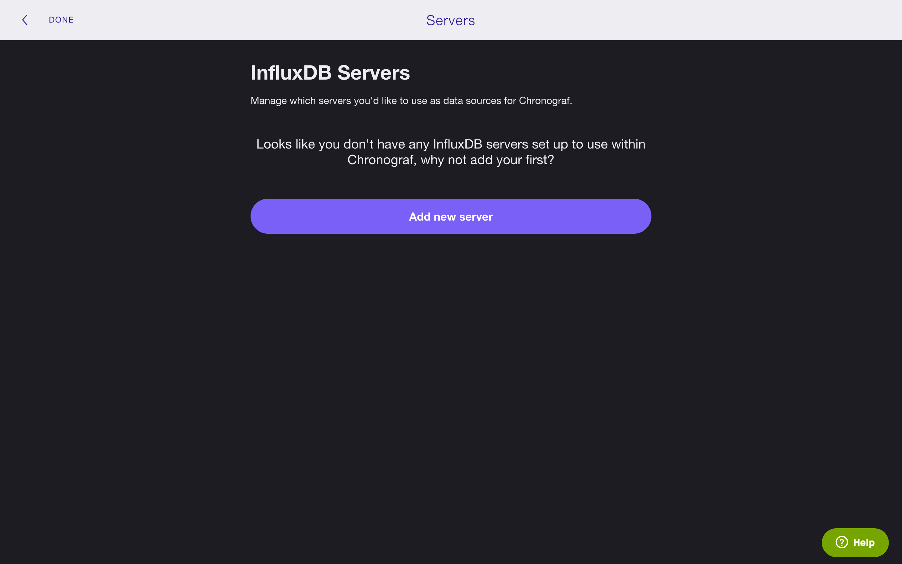
Check to see that Chronograf is running at http://127.0.0.1:10000. If this is the first time you’ve started Chronograf, you’ll see this:
NOTE: By default, Chronograf runs on localhost port
10000. Those settings are configurable; see the configuration file to change them and to see the other configuration options. We list the location of the configuration file by installation process below.
- Debian or RPM package:
/opt/chronograf/config.toml- macOS via Homebrew:
/usr/local/etc/chronograf.toml- Standalone macOS binary:
chronograf-0.x.x/chronograf.toml
Now that you’ve got everything installed and running it’s time to start visualizing your data in Chronograf!
Add your first Server
Direct Chronograf to your InfluxDB data by adding a server:
1.
Click the Add new server button.
2.
Fill out the form with the relevant information.
In this step the only required fields are NICKNAME, HOST, and PORT.
In the example below, we’ve called our server InfluxDB-1 and it’s running on localhost on port 8086 (the default HOST and PORT for InfluxDB).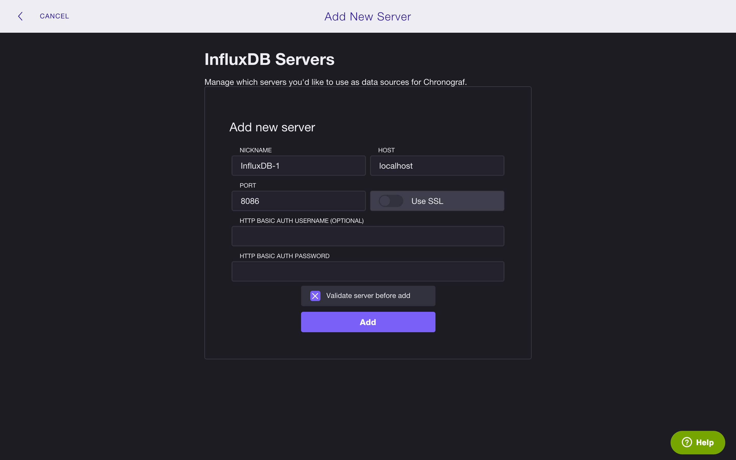
3.
Click the Add button.
In the image below, notice that Chronograf is now aware of our InfluxDB server InfluxDB-1.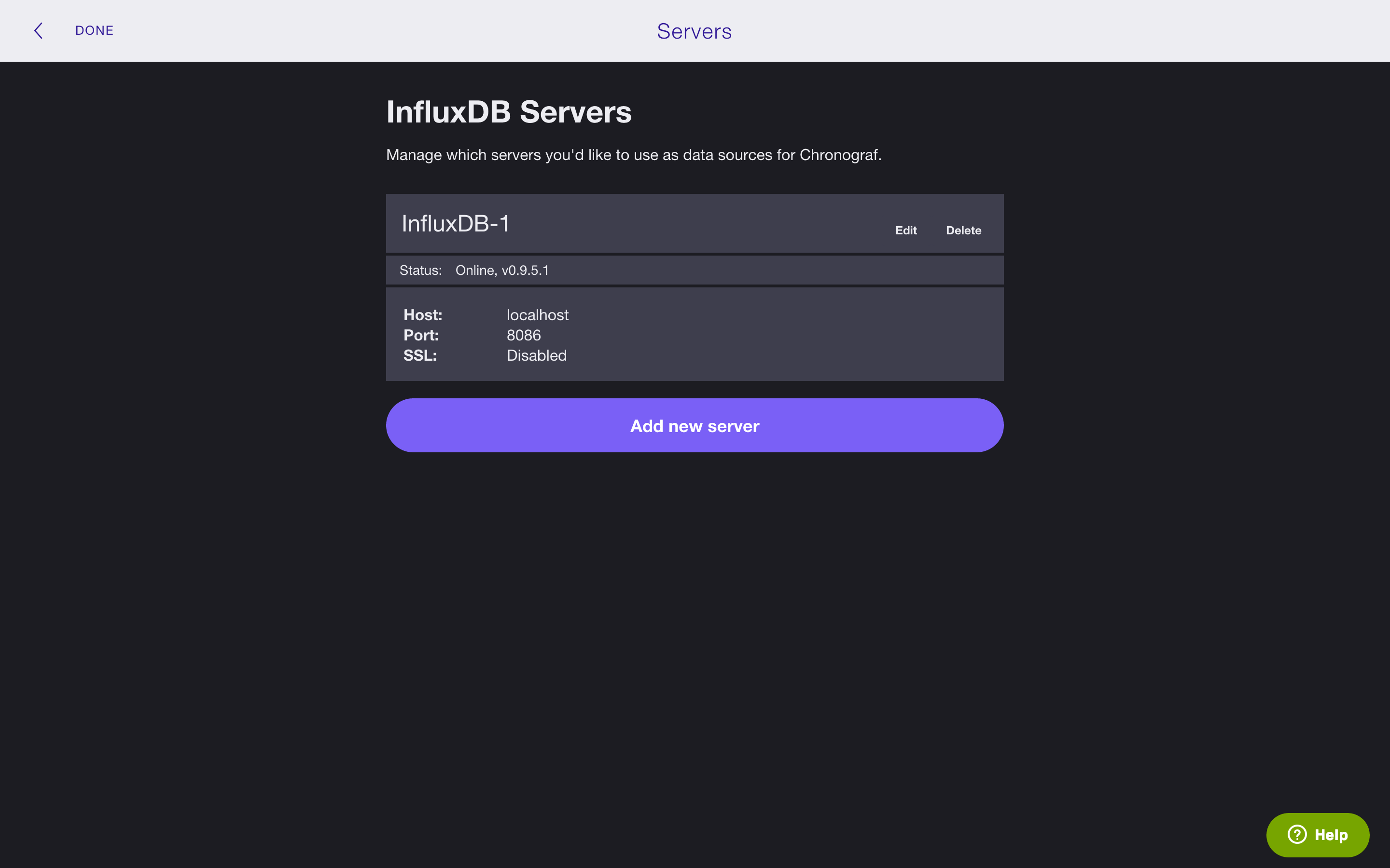
Click Done in the top left corner and move on to the next section to create your first graph.
You can always return to the Servers page by clicking on the gear in the top right corner.
Create your first Visualization
It’s time to graph your data. In the next steps, we’ll create an example graph that shows the average idle CPU percentage grouped by CPU tag and by one minute time intervals. If you’d like to follow along, see Getting Started with Telegraf to get the data we use in this section.
1.
Click + and name your graph in the New Graph window.
We’ll call our graph Average idle CPU usage.
2.
Click the Save button.
3.
Click the + Add Query button and choose the server, database, and retention policy that you want to work with: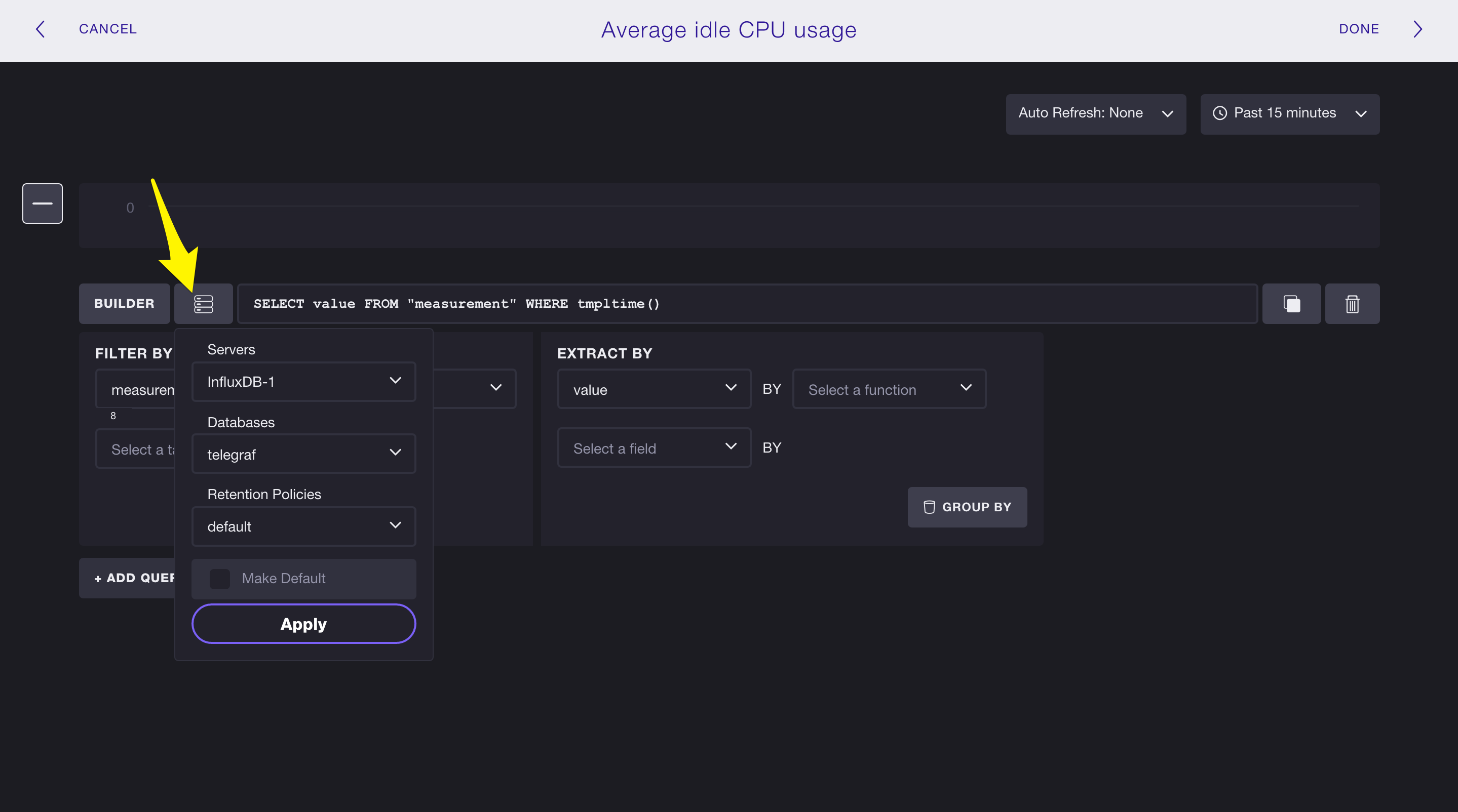
In this example, we’re working with the the server InfluxDB-1, the database telegraf, and the retention policy default.
4. Create your query.
To create a query, you can either use the Query Builder or, if you’re already familiar with InfluxQL, you can manually enter the query in the text input. In this step, we write the query manually.
Our query calculates the average of the field key usage_idle in the measurement cpu, and it GROUPs BY the tag cpu and by one minute intervals. The query asks for data that fall within the past 5 minutes.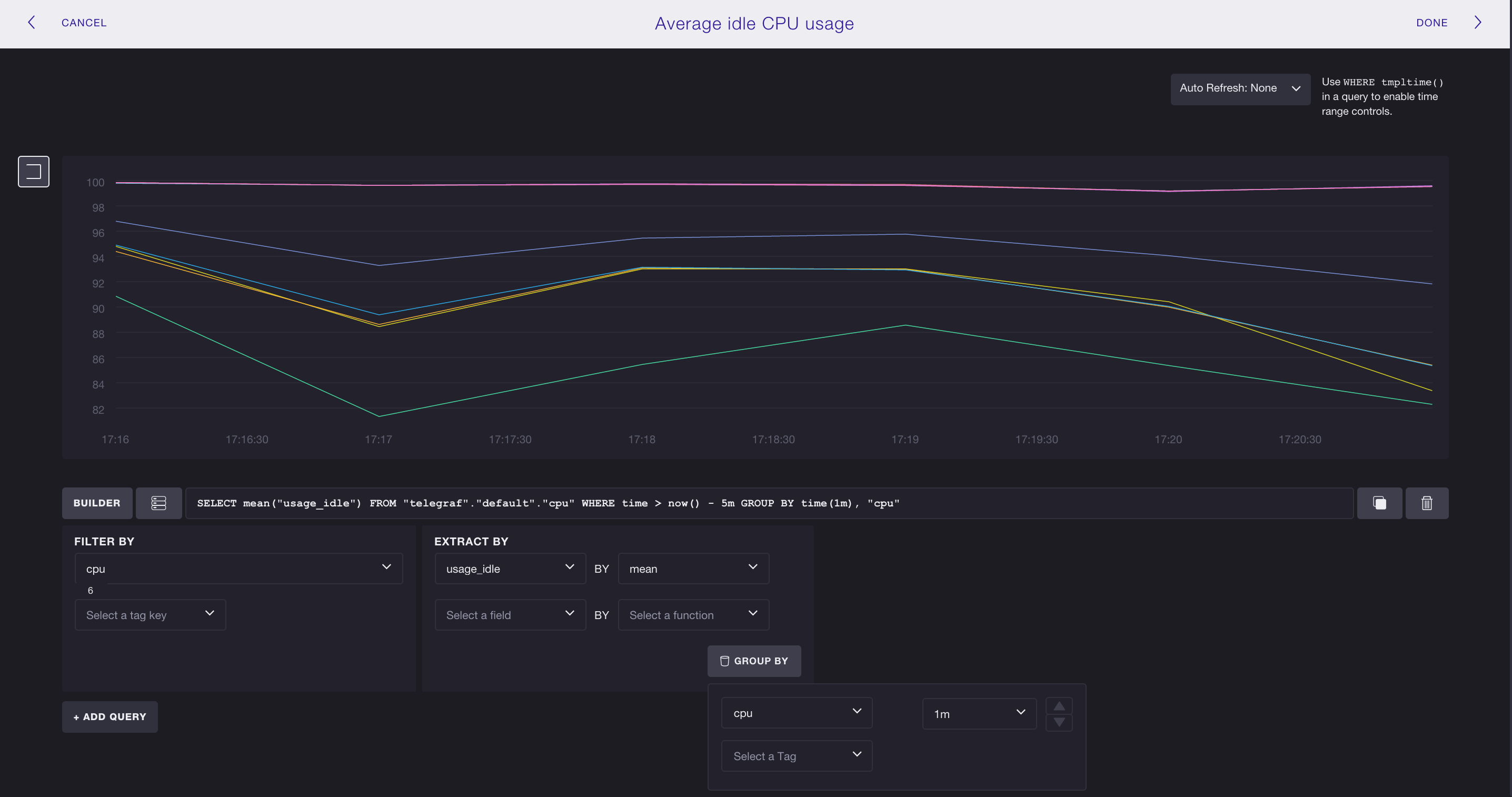
Click Done in the top right corner to complete your graph, and move on to the next section to create your first dashboard.
Create your first Dashboard
Now that we have a graph we want to add it to a dashboard.
1.
Move to the DASHBOARDS tab at the top of your screen.
2.
Click + and name your dashboard in the New Dashboard window.
We’ll call our dashboard Idle CPU usage.
Because our dashboard has no visualizations, it looks like this: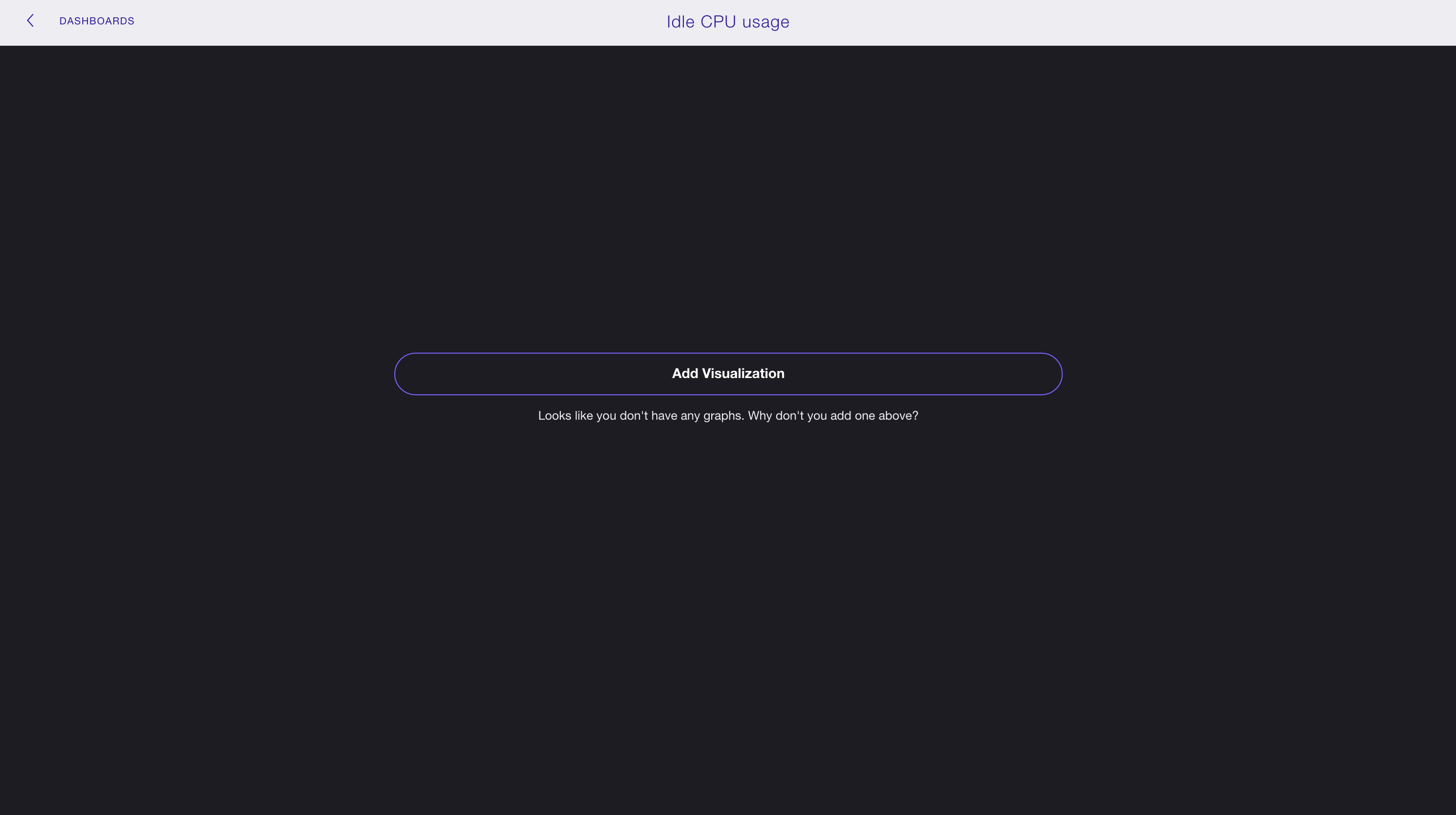
3.
Click the Add Visualization button.
4.
We want to add the graph we made in the section above so we click Add From Existing Visualizations.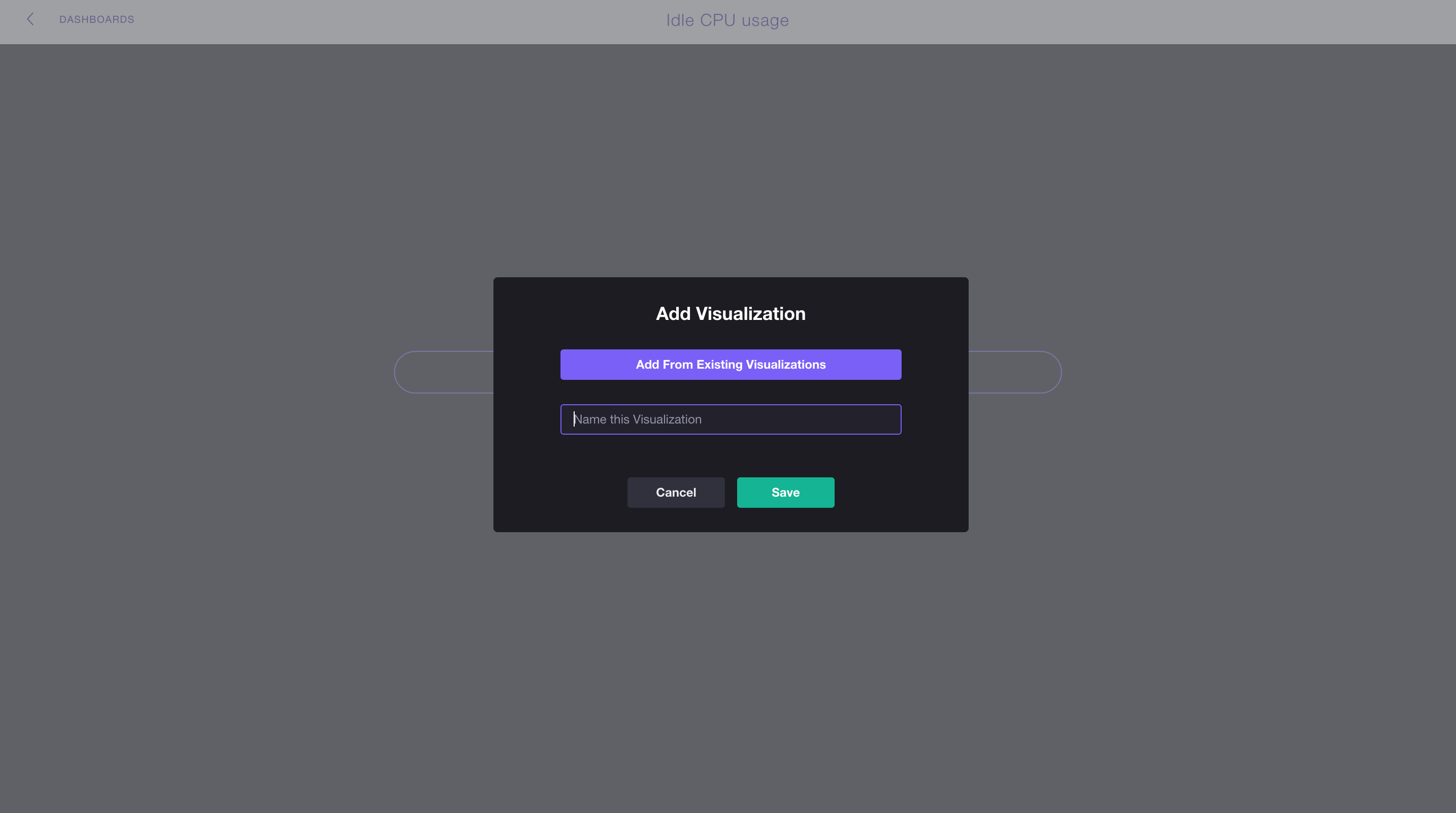
5.
Select Average idle CPU usage and click the Add Visualizations to Dash button in the top right corner.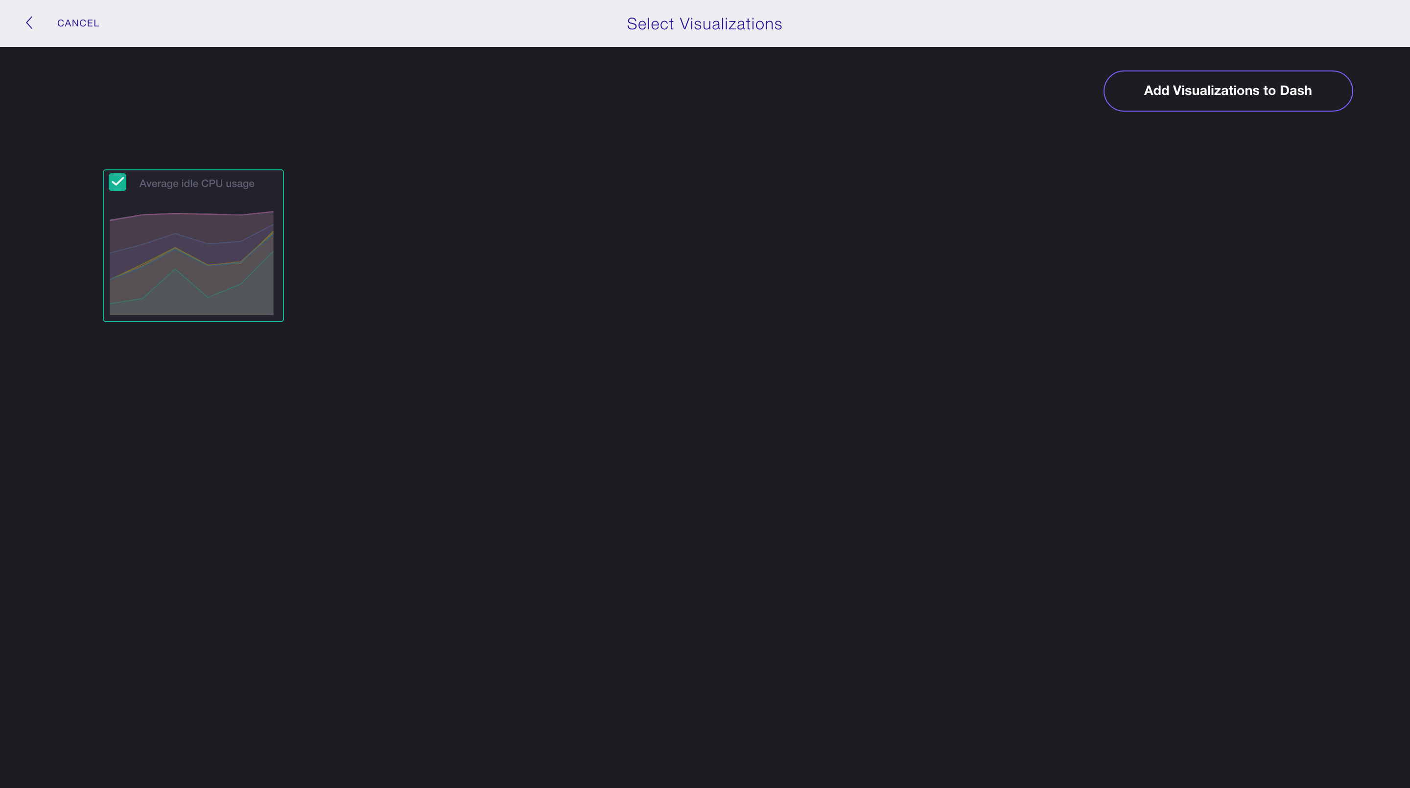
That takes us back to our new dashboard!
One visualization on a dashboard isn’t spectacularly interesting, so we’ve added a couple more graphs to show you some of the possibilities: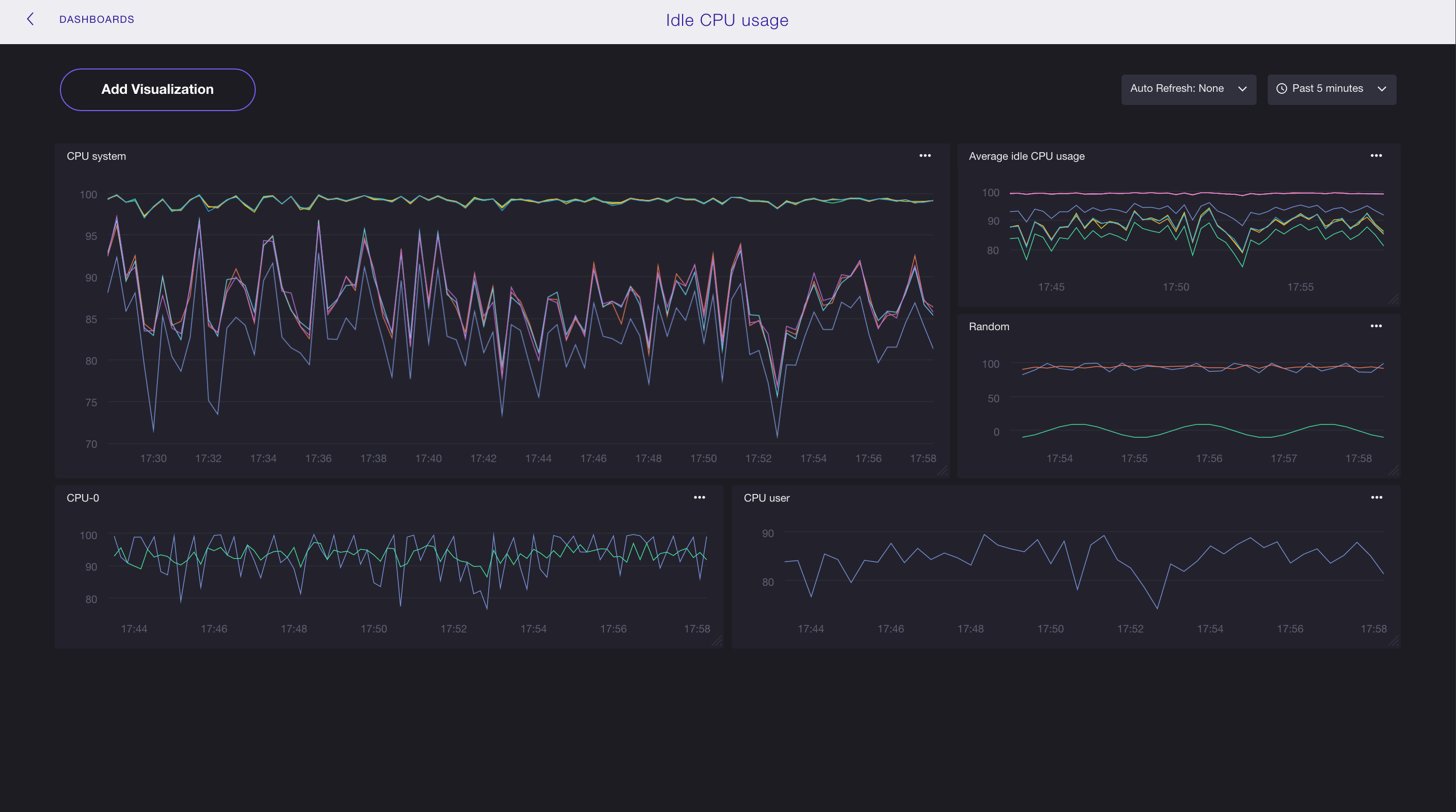
And that’s it! You now have the foundation for building beautiful data visualizations and dashboards with Chronograf.