This is archived documentation for InfluxData product versions that are no longer maintained. For newer documentation, see the latest InfluxData documentation.
Chronograf offers a complete dashboard solution for visualizing your data and monitoring your infrastructure. Use Chronograf’s pre-created dashboards or create customized dashboards to meet your setup’s needs. This guide introduces Chronograf’s customized dashboard features.
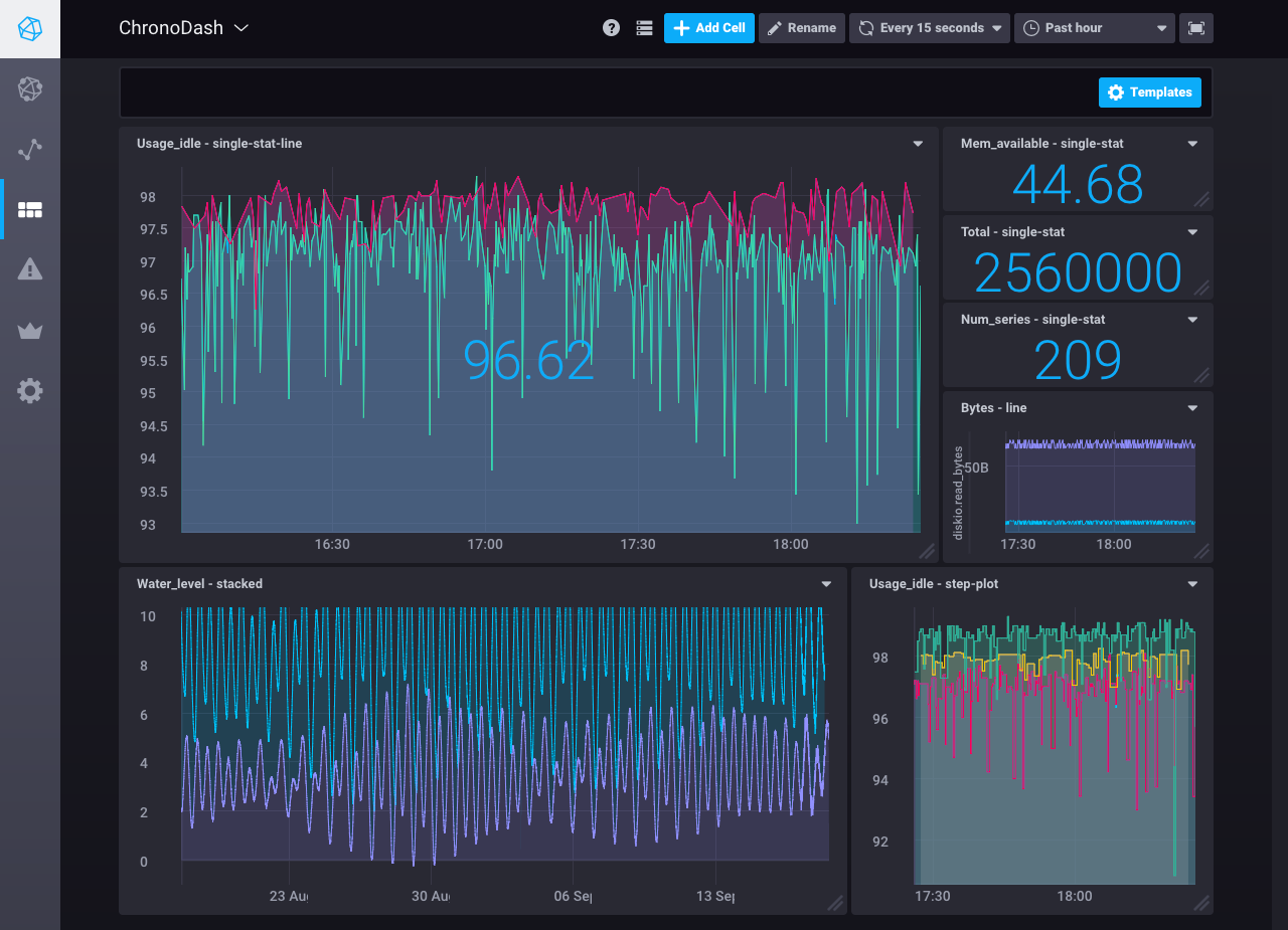
By the end of this document, you’ll be aware of all the tools you need to create a dashboard similar to this one:

Requirements
This guide assumes you have a working Chronograf instance that’s connected to an InfluxDB source. It uses data from Telegraf’s system statistics input plugin. See the Getting Started guide for step-by-step installation and configuration instructions.
Build a Dashboard
Before you start, navigate to the Dashboards page and click on the Create Dashboard button.
That button takes you to your new dashboard; this is your blank canvas on which you’ll create your visualization masterpieces.
Step 1: Name your dashboard
Click the Rename icon at the top of the page.
Name your dashboard anything you want.
Here, we call it ChronoDash.

Step 2: Enter cell editor mode
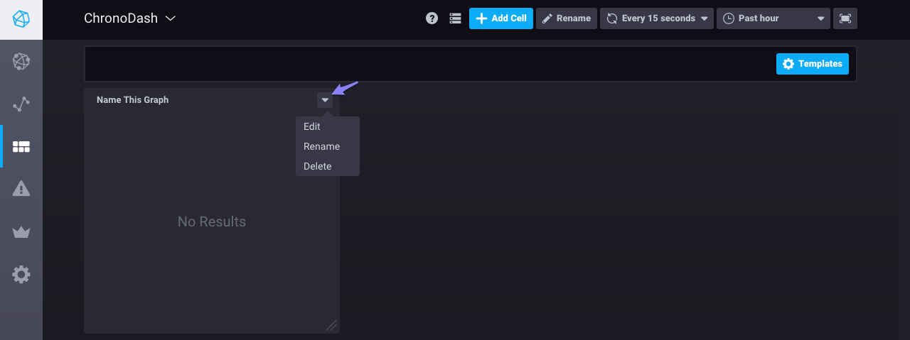
Click on the carrot in the existing cell’s top right corner and select Edit.
This step takes you to cell editor mode.

Step 3: Create your query
Click on the blue Add a Query button to create and edit an InfluxQL query.
In query editor mode, use the builder to select from your existing data and allow Chronograf to format the query for you.
Alternatively, manually enter and edit a query.
Chronograf allows you to move seamlessly between using the builder and manually editing the query; when possible, the interface automatically populates the builder with the information from your raw query.
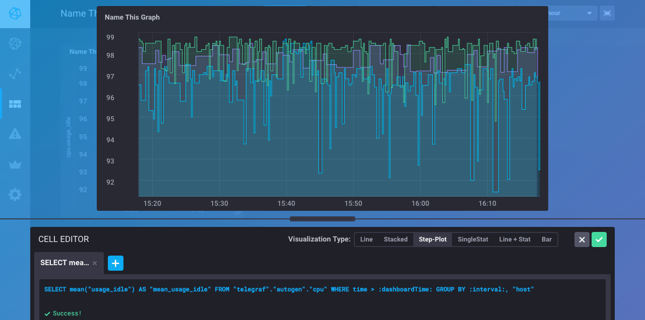
Here, we use the builder to generate a query that shows the average idle CPU usage grouped by host (in this case, there are three hosts).
By default, Chronograf applies the MEAN() function to the data, groups averages into auto-generated time intervals (:interval:), and shows data for the past one hour (:dashboardTime:).
Those defaults are configurable via the builder or by manually editing the query.
In addition, the time range (:dashboardTime:) is configurable on the dashboard.

Step 4: Choose your visualization type
Chronograf supports several visualization types:
Here, we choose the Step-Plot:

Step 5: Save your cell
Click on the green checkmark to save your cell. Note that Chronograf does not save your cell if you navigate away from this page without clicking that checkmark.
Step 6: Configure your dashboard
Customize cells:
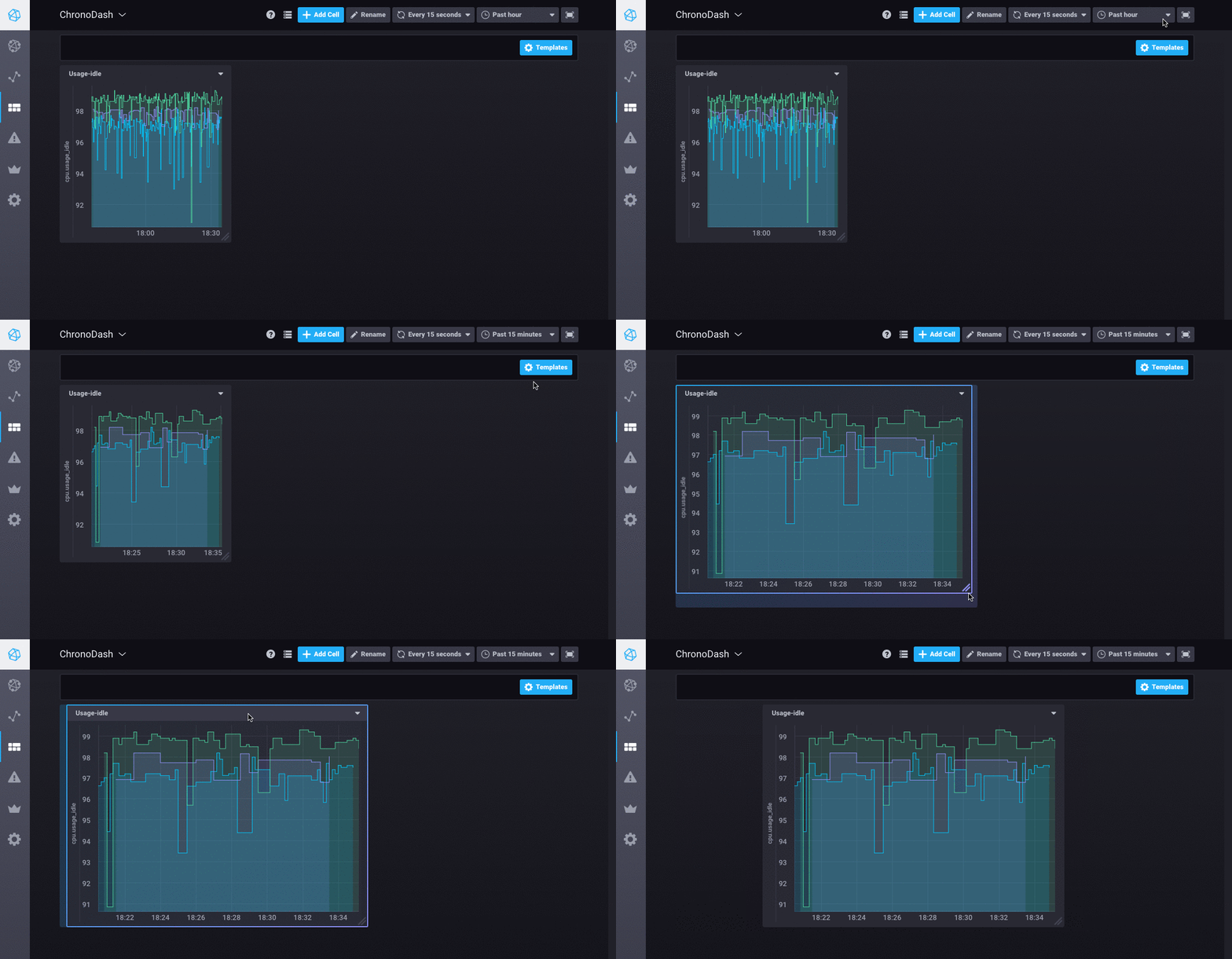
- Rename your cell by clicking on the carrot in its top right corner and selecting
Rename - Move your cell around by clicking its top bar and dragging it around the page
- Resize your cell by clicking and dragging its bottom right corner
Explore cell data:
- Zoom in on your cell by clicking and dragging your mouse over the area of interest
- Pan over your cell data by pressing the shift key and clicking and dragging your mouse over the graph
- Reset your cell by double-clicking your mouse in the cell window
Note: These tips only apply to the line, stacked, step-plot, and line+stat visualization types.
Configure dashboard-wide settings:
- Set the dashboard’s auto-refresh interval at the top of the page - the default interval is every 15 seconds
- Set the dashboard’s time range at the top of the page - the default range is the past one hour

Next, complete your dashboard by creating, editing, and repositioning more cells!
Extra Tips
Full screen mode
View your dashboard in full screen mode by clicking on the full screen icon in the top right corner of your dashboard. To exit full screen mode, press the Esc key.
Template variables
Dashboards support template variables. See the Dashboard Template Variables guide for more information.